I recently read a book by Steve Krug called "Don't Make Me Think," and it really made me think (pun intended) about web usability and navigation. Yes, this book came out years ago, but its usability lessons are still very relevant to today's age of web design.
The theme of this book basically boils down to this: if people cannot easily navigate their way around your website, they'll leave it. It's that simple. In an age where every other business is just a click away, if people get frustrated with a site, they'll leave and go to a competitor whose site isn't as cluttered and hard to navigate.
Oftentimes website designers want to get really creative with the site and try to "re-invent the wheel." That is unnecessary because there are certain web conventions everyone is familiar with, and a website should always be user-friendly. There are a few basic layout and navigation principals that should always be followed:
5. There's no place like home
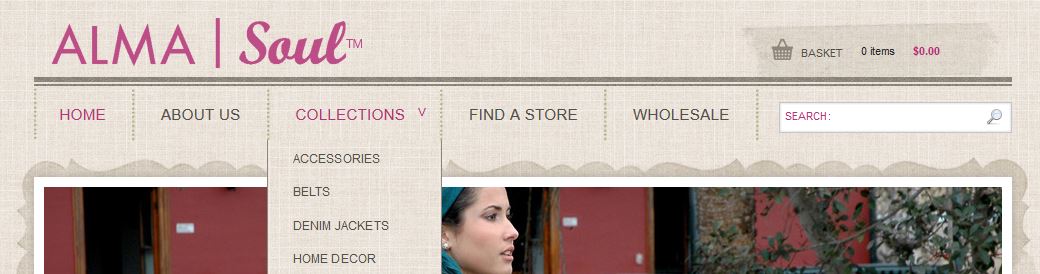
There should always be a button where a visitor can easily return "home." It gives them comfort that no matter how lost they get in your site, there's always a "reset" button. There is a wonderful website convention that the site id you find in the upper left corner doubles as a button that can take you back to the home page.

4. No happy talk
Happy talk is like small talk – content free, basically just a way to be sociable. Most website users don't have time to comb through your introductory promotional text. As a good rule of thumb you should omit needless words that no one is really going to read.
3. Have persistent navigation
There's nothing worse than clicking a link to find you're not in Kansas anymore. Every page on your site (perhaps with the exception of the home page or pages where forms need to be filled out) needs to have consistent elements. This gives visitors the reassurance that they are in fact still on the same website after clicking that link. The navigation, search function, and site id should always appear the same.

2. The home page should always convey the big picture
Speaking of the home page, it should answer questions like: what is this site? What can I do here? What do they have here? People should be able to get to the home page and know exactly what the main point of the entire site is. Spell it out.
1. Create a clear visual hierarchy
The most important headings should always be more prominent, either by larger, bolder text, or a different color or a combination of all three.
If your website could use a usability makeover, contact us today!